Hope you like it!
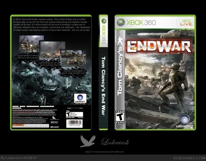
Ubisoft logo on the back is the official ubisoft "developed and published by" logo. Hence, it is not meant to be cut out. ESRB is meant to be over the tom clancy's bar which I reproduced by hand. If you need it, PM me.
This is the reason I am losing interest in this site. All the front is is a wallpaper with a logo on it. And yet you all complain if someone new does that. I know everyone uses wallpapers from time to time, but it really pisses me off that all of the "great" boxes on the site are nothing more than wallpapers on a template. Can someone explain to me how it requires any talent at all to make this front, other than to make the Tom Clancy sidebar, if you did make that by hand? I mean, even the back is uncomfortably empty. The only thing you really worked at was typing the text out and positioning the screens...
this is really great, #8, so what if it's a wallpaper? even people like Hellknight and Electric General have used wallpapers, hell, WickedGamer1's latest box was just a wallpaper. You yourself have used wallpapers a few times, so don't talk crap like that. And so what if the front didn't require much effort, it's obvious that the back did, so we know that he did but effort into this, even if the front is a wallpaper. not all the best boxes on the site are wallpapers on templates. You said Mad Spike has used wallpapers, and he has a few times, but he massively edits them which requires EFFORT. Almost everyone has used a wallpaper before, including me, even YOU. So please stop complaining.
sorry 'bout that Lodo, i was just trying to make a point. This box is excellent.
Rofl, I knew the front would be controversial....I was just expecting someone else to bring it up.
Anyways, the front is not only JUST a wallpaper. It has noise added to it (excluding the main character) and slightly less saturation count then that of the original. To add, the logo took ages to cut out, which, I might add, required a hell of a lot of effort.
So, critisize me for using material which you frown upon, but do not claim that this required liite effort, when you do not fully no of the effort put in.
This is great. Yet, if someone else were to do it, like persian boxart guy, you guys would critisize him for use of wallpapers. Not saying that it it bad to do so, but, you must apply your style, you must apply effort, and you must apply time. I can see that Lodovick did just that.
 Tom Clancy's EndWar Box Cover Comments
Hope you like it!
Ubisoft logo on the back is the official ubisoft "developed and published by" logo. Hence, it is not meant to be cut out. ESRB is meant to be over the tom clancy's bar which I reproduced by hand. If you need it, PM me.
[ Reply ]
dude.. why did you delete it?
[ Reply ]
#2, spelling mistake :p
[ Reply ]
The awesomeness burns my eyeballs....It feels pretty good, actually, like scratching an itch...But this really is amazing, great job!
[ Reply ]
#4, rofl Thanks mate!
[ Reply ]
weird the Tom Clancy side logo was freaking me out, it has a very small curve and i thought my eyes went retarded. lol!
its pretty cool but i would combined them all and make it look like a full spread box.
[ Reply ]
Very nice! I really like how you placed out the screenshots on the back.
[ Reply ]
This is the reason I am losing interest in this site. All the front is is a wallpaper with a logo on it. And yet you all complain if someone new does that. I know everyone uses wallpapers from time to time, but it really pisses me off that all of the "great" boxes on the site are nothing more than wallpapers on a template. Can someone explain to me how it requires any talent at all to make this front, other than to make the Tom Clancy sidebar, if you did make that by hand? I mean, even the back is uncomfortably empty. The only thing you really worked at was typing the text out and positioning the screens...
[ Reply ]
this is really great, #8, so what if it's a wallpaper? even people like Hellknight and Electric General have used wallpapers, hell, WickedGamer1's latest box was just a wallpaper. You yourself have used wallpapers a few times, so don't talk crap like that. And so what if the front didn't require much effort, it's obvious that the back did, so we know that he did but effort into this, even if the front is a wallpaper. not all the best boxes on the site are wallpapers on templates. You said Mad Spike has used wallpapers, and he has a few times, but he massively edits them which requires EFFORT. Almost everyone has used a wallpaper before, including me, even YOU. So please stop complaining.
sorry 'bout that Lodo, i was just trying to make a point. This box is excellent.
[ Reply ]
This is awesome 5/5 . Who rly cares if it a Wallpaper.
[ Reply ]
#10, *Really*
[ Reply ]
nice to see a good endwar box, finally.
[ Reply ]
I Love the front, but I'm not so certain with the back...
Now I'm wondering how it would look if the logo had an inner drop shadow...
[ Reply ]
#4, agreed, this is pretty darn awsome, love the back!
[ Reply ]
Rofl, I knew the front would be controversial....I was just expecting someone else to bring it up.
Anyways, the front is not only JUST a wallpaper. It has noise added to it (excluding the main character) and slightly less saturation count then that of the original. To add, the logo took ages to cut out, which, I might add, required a hell of a lot of effort.
So, critisize me for using material which you frown upon, but do not claim that this required liite effort, when you do not fully no of the effort put in.
[ Reply ]
Great job.
[ Reply ]
#16, Thanks general
[ Reply ]
#15 excellently put my friend.
[ Reply ]
This is great. Yet, if someone else were to do it, like persian boxart guy, you guys would critisize him for use of wallpapers. Not saying that it it bad to do so, but, you must apply your style, you must apply effort, and you must apply time. I can see that Lodovick did just that.
[ Reply ]
#19, Thanks....I think :p
[ Reply ]
thanks for the favs everyone...
[ Reply ]
You might find that I comment with conversations going on in my head.
[ Reply ]
#22, ok...lol
[ Reply ]