*Ignoring the horny Joanna picture* :P. One of the main problems I see is the arrangement on the back isn't very professional. Adding on to what Ratchet said, the synopsis' text seems a bit too big. Also the front is missing a few things like the NTSC logo and the "Only for" tag. Not too bad though.
 Perfect Dark Betrayal Box Cover Comments
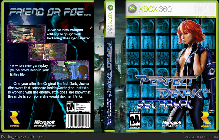
It ttok me a long time to do this one, so i hope you enjoy!!!
template by Crayon Man.
please comment.
Edited at 1 decade ago
[ Reply ]
It O.K 3/5
The things that are wrong
1. You need a copyright on the back .
2. You need Xboxlive .
I like the front and the background though .
[ Reply ]
*Ignoring the horny Joanna picture* :P. One of the main problems I see is the arrangement on the back isn't very professional. Adding on to what Ratchet said, the synopsis' text seems a bit too big. Also the front is missing a few things like the NTSC logo and the "Only for" tag. Not too bad though.
[ Reply ]
Joanna looks like a pornstar.
[ Reply ]
#4, ...and this is bad why? =P
[ Reply ]
O___o The front looks amazing, so it's faved just for that.
[ Reply ]
#6, and why do you think it's amazing? ;)
[ Reply ]
#7, :P Why do YOU think?
[ Reply ]