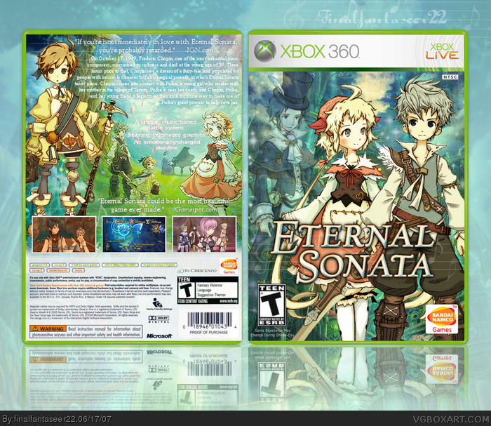
I love this, the only thing that bothers me slightly is the chopin art on the front being transparent on a rather busy background - though I totally understand the effect/feeling your trying to achieve with it. Obviously this is the best trusty bell / eternal sonata box by far. ;]
I was in the process of gathering up artwork and creating a design. Seeing as how i don't think i can top this... *shakes fist in your general direction*
My only gripe is the game summary text on the back could use a subtle black glow/drop shadow or something to make it stand out a bit more. It's a bit lost against the bright background.
i personally thought the text stood out enough... i did add strokes but im sure it could be more visible... so maybe later i might come around another time with an update to fix the whole text problem.
also (sorry for the double post)
but about the transparent guy on the front-- do you think i should lower his opacity or remove him completely or what, any suggestions?
#14, well, they usually never take me that long...
i think it's ridiculous when someone says how long they work on a box... it's not worth 6 days making a box, the longest a box a taken me is maybe a few hours.
 Eternal Sonata Box Cover Comments
my personal most anticipated game... ever.
[ Reply ]
finalfantaseer22 must be destroyed immediately.
[ Reply ]
I love this, the only thing that bothers me slightly is the chopin art on the front being transparent on a rather busy background - though I totally understand the effect/feeling your trying to achieve with it. Obviously this is the best trusty bell / eternal sonata box by far. ;]
[ Reply ]
It's a bit busy, and there is a bit to much text. But other than that, it's great. But the transparent guy on the front kind of bother me :)
[ Reply ]
The text is kinda hard to read. Add a dark stroke or something.
[ Reply ]
I was in the process of gathering up artwork and creating a design. Seeing as how i don't think i can top this... *shakes fist in your general direction*
My only gripe is the game summary text on the back could use a subtle black glow/drop shadow or something to make it stand out a bit more. It's a bit lost against the bright background.
Great job as always. (b^^)b
[ Reply ]
Great job finalfantaseer22 ! 5/5.
[ Reply ]
awesome!!!!!!!!!! 5/5!!!! and where did you find that temp?? can you pm me it?
[ Reply ]
i don't really like the IGN quote on the back. it makes me feel like a loser because this doesn't look like my kinda game.
[ Reply ]
It is pretty, but I think the text needs to stand out more like others have said.
Edited at 1 decade ago
[ Reply ]
Great box man, i love the art systle of the box 5/5 .
[ Reply ]
#9, haha glad you noticed
i personally thought the text stood out enough... i did add strokes but im sure it could be more visible... so maybe later i might come around another time with an update to fix the whole text problem.
[ Reply ]
also (sorry for the double post)
but about the transparent guy on the front-- do you think i should lower his opacity or remove him completely or what, any suggestions?
[ Reply ]
wow you make boxes a lot! you made more boxes than me in 1 week.
[ Reply ]
#14, well, they usually never take me that long...
i think it's ridiculous when someone says how long they work on a box... it's not worth 6 days making a box, the longest a box a taken me is maybe a few hours.
[ Reply ]
Wow...the front looks great. I just think that the text on the back can be in a better font.
[ Reply ]
Yay hooray.
[ Reply ]
Haha, the quote is hilarious.
Yesh, I bumped it =/
[ Reply ]
Wow,I love this
[ Reply ]