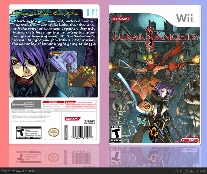
Its not bad, but a few improvements I can suggest:
1) Put the konami logo in the grey bar "where it says publisher address 1,2,3"
2) Thank goodness you've not put an outline or unrequired outerglow. Just look for a better font for the synopsis on the back.
3)I don't think that the konami logo belongs on the front cover. I'm also not exactly sure whether it is a wallpaper or how much you editted the front cover - but it looks nice so don't change it.
 Lunar Knights Box Cover Comments
Here's my Lunar Knights box. Hope you like it.
[ Reply ]
Its not bad, but a few improvements I can suggest:
1) Put the konami logo in the grey bar "where it says publisher address 1,2,3"
2) Thank goodness you've not put an outline or unrequired outerglow. Just look for a better font for the synopsis on the back.
3)I don't think that the konami logo belongs on the front cover. I'm also not exactly sure whether it is a wallpaper or how much you editted the front cover - but it looks nice so don't change it.
Overall, good attempt. :)
Edited at 1 decade ago
[ Reply ]
Very good but i thnik you could squeeze one or two more screen shots
[ Reply ]