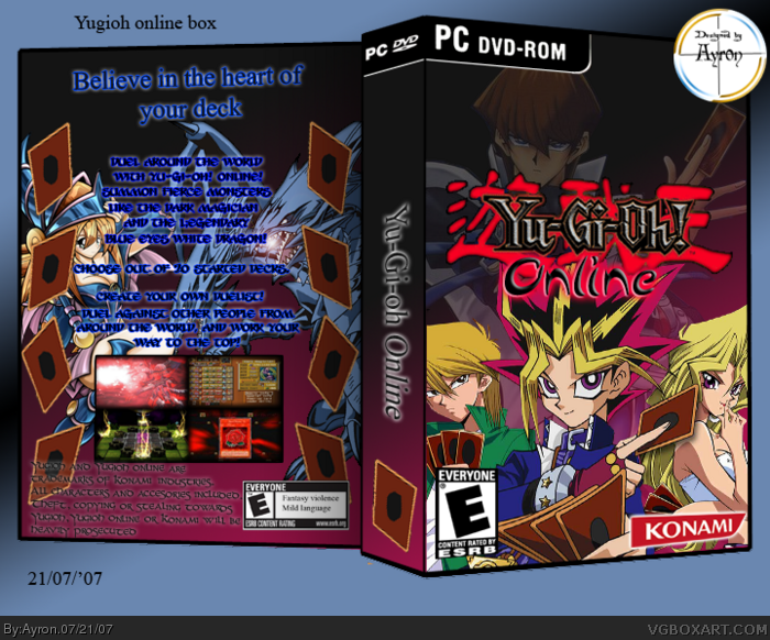
I assume this is your first 3D box? as there are some problems.
Don't distort the E logos, konami, e.t.c after you've made the front cover and then place them. Include them in the 2D version of the front and then only distort the front of the box to a 3D perspective.
The spine is also stretched. Try to make it as thin as possible on a PC box (width) keeping the height the same. Best use the full 2D template of PC boxes (in the forums) as the have the right measurement of spine.
One of my biggest suggestions to you is STAY AWAY from outer glow. It is evil. Pure evil S.O.B. That ruins 95% of the text on any artwork. Unless you are totally certain its useful.
You don't need to use black font with outer glow. Just go with a contrasting color of font. Maybe white, light pink, light purple, e.t.c. WITHOUT outer glow, o' course.
Remember this mantra - less text effect = easier to read font.
hmm, yeah it helps. i'll fix the text asap, and i think i'll keep the temp the same.. i don't quite know how to fix the esrb and konami logo's, but i'll give it a try. the spine looks fine to me though.
plus it's not my first 3d box. but no-one has actually givin a good comment on them.xD
 Yu-Gi-Oh Online Box Cover Comments
My Yugioh online box..
Comments are appreciated as always ^^
[ Reply ]
I assume this is your first 3D box? as there are some problems.
Don't distort the E logos, konami, e.t.c after you've made the front cover and then place them. Include them in the 2D version of the front and then only distort the front of the box to a 3D perspective.
The spine is also stretched. Try to make it as thin as possible on a PC box (width) keeping the height the same. Best use the full 2D template of PC boxes (in the forums) as the have the right measurement of spine.
One of my biggest suggestions to you is STAY AWAY from outer glow. It is evil. Pure evil S.O.B. That ruins 95% of the text on any artwork. Unless you are totally certain its useful.
You don't need to use black font with outer glow. Just go with a contrasting color of font. Maybe white, light pink, light purple, e.t.c. WITHOUT outer glow, o' course.
Remember this mantra - less text effect = easier to read font.
Hope this helps. :)
Edited at 1 decade ago
[ Reply ]
hmm, yeah it helps. i'll fix the text asap, and i think i'll keep the temp the same.. i don't quite know how to fix the esrb and konami logo's, but i'll give it a try. the spine looks fine to me though.
plus it's not my first 3d box. but no-one has actually givin a good comment on them.xD
Edited at 1 decade ago
[ Reply ]
What Dmshaposv said. The front isn't that bad though.
[ Reply ]
i'll update asap, here's 2d:http://i197.photobucket.com/albums/aa224/ayr0n/2d.png
Edited at 1 decade ago
[ Reply ]
agreed with #2
btw none of those pics are even from yugioh online, and that's not the official logo, and why is the spine so thick?
yugioh is one of those things you need to be a big fan of to do things like making boxarts. ;)
Edited at 1 decade ago
[ Reply ]
I agree with dmshaposv.
[ Reply ]
#6, didn't know there was a yugioh online.XD
[ Reply ]