You are getting good with every boxart now. Keep it up!
I suggest these improvements on this box:
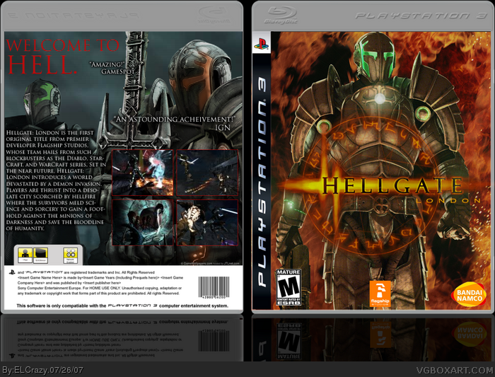
- A smaller Flagship studios logo on the front. Typically about the same height as the Bandai Namco logo.
- Use the official bandai namco logo.
- Less choppy M-rated logo on both sides. The font they use for "Blood, intense violence, e.t.c" is generally Arial/Arial Black
-More screens, 3 should be minimum and there is no max limit. 2 Screens are too less. Also get rid of the Beveal and Emboss, and go for an easy Red or white 1 pixel stroke.
There, I've given you the most constructive criticism you'll ever get. :P
Yea you are getting better and better I have noticed after every boxart. Well done on this and I bet with a little more hard work and time you can become one of the best boxartists on the site ;)
Great job, you might want to make the reflections a bit more visible, and use a lighter template like HK's. If you do that I'll make it a favorite. They're not the arts themselves but they bug me.
 Hellgate: London Box Cover Comments
Well, it's finally done.
I had a tough time doing the front until I downloaded the fansite kit.
So, what'd you think?
[ Reply ]
Hey it looks great and all but that's not the official bandai namco logo...or did they make a logo change?
[ Reply ]
the front is radical. i love that picture. but you should use the official temp, this temp kinda kills it.
[ Reply ]
You are getting good with every boxart now. Keep it up!
I suggest these improvements on this box:
- A smaller Flagship studios logo on the front. Typically about the same height as the Bandai Namco logo.
- Use the official bandai namco logo.
- Less choppy M-rated logo on both sides. The font they use for "Blood, intense violence, e.t.c" is generally Arial/Arial Black
-More screens, 3 should be minimum and there is no max limit. 2 Screens are too less. Also get rid of the Beveal and Emboss, and go for an easy Red or white 1 pixel stroke.
There, I've given you the most constructive criticism you'll ever get. :P
Hope you work on those.
[ Reply ]
Thanks for the comments. DM, I'll get right onto it!
Can anyone provide me with the official temp?
[ Reply ]
#5, look in the VGBA database, link, bookmark this page.
[ Reply ]
Thanks! :)
[ Reply ]
Yeah. Made the transition to a different template.
UPDATED!!
[ Reply ]
...wow... congrats man, this is your best box
4.5/5 +fav
[ Reply ]
Thanks, dude. Really appreciate it. :)
[ Reply ]
Yea you are getting better and better I have noticed after every boxart. Well done on this and I bet with a little more hard work and time you can become one of the best boxartists on the site ;)
[ Reply ]
Great job, you might want to make the reflections a bit more visible, and use a lighter template like HK's. If you do that I'll make it a favorite. They're not the arts themselves but they bug me.
[ Reply ]