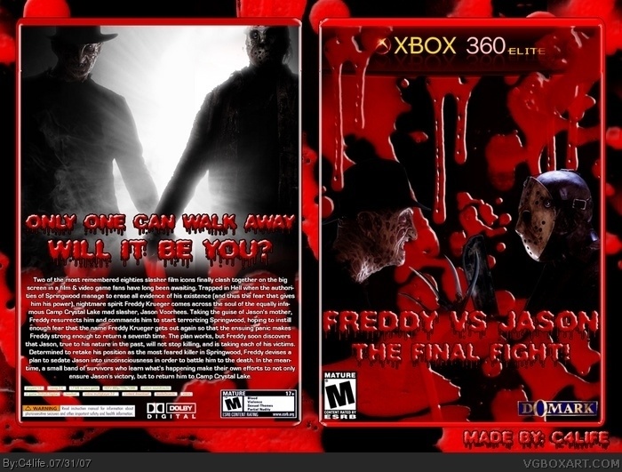
Too much blood, boring back with 1 big block of text slapped on (change it by adding screenshots and small taglines besides the screenshots). The logo is just some text with a filter/effect, also really boring. 1/5.
#2,I just figured it was a nice touch. It goes with the theme.
#4, looks better then the crap you have made. lol I'm not even gonna pay your rating any attention. Anyways as far as the logo goes. It's the company that made the Original Friday the 13th video game. Learn your history before you speak.
#5, If you can't handle critism why submit your box? Atleast I can make a living out of my designing, I know people who can't say that Mr. C4life. Looking at your reply it doesn't even seem you understood what I wrote. I didn't said anything about the company that made the game, I know my history very well as I grew up in the NES era. Dawg :)
#6, I can take critism, but u my friend were being an asshole. You can't look st this box and tell me that's one potential. Hell i'm not cocky, but i'll be damned if it's anything less then a 3, and u go and give me a 1. Tell me you weren't being an ass, but it's cool. I seem to find at least one jerk in most community sites I go to. So no sweat. :) Also i read your post. You said the logo was in other words crappy, and i was just letting you know it's official, and not made up. Also I was brought up in the NES era aswell. So you are telling me nothing!
#7, And I'm telling you I meant the logo of the game. This is the first and last time I gave a rating, when you don't give one atleast people respect your critism instead of whining they got a 1. I wasn't an ass, I was giving my opinion on how I think about the box, nothing wrong about that.
Like I said B4. theres a difference between giving critism & being a jerk & u my good chum are a jerk. point blank i'm done. you can comment if you want i'm through with it. Not what i posted my box for.
Relax buddy, it's the internets. If I would've been a jerk I could've said you stolen it, or didn't put any effort in or maybe lack graphical skills but I didn't. I just told you what I didn't like about the box.
#11, Yeah that's a good reason to not like it. I swear it's no pleasing people on this site. If you rush people complain, and then you take your time, and people still aren't happy. You have the people who come just to enjoy the art. Then you have the people who take this so damn serious. Complaining over something as dumb as a ESRB logo being a little too high or low. Come on guys it's just art. We aren't getting paid for it.
 Freddy VS Jason Box Cover Comments
Well here's a new submission from me. Hope you all like it.
[ Reply ]
xbox blood60?
[ Reply ]
That's something rare you'd see on GameStop and EbGames shelves.
It's pretty good even with it's glory gory gore. 4/5
Edited at 1 decade ago
[ Reply ]
Too much blood, boring back with 1 big block of text slapped on (change it by adding screenshots and small taglines besides the screenshots). The logo is just some text with a filter/effect, also really boring. 1/5.
[ Reply ]
#2,I just figured it was a nice touch. It goes with the theme.
#4, looks better then the crap you have made. lol I'm not even gonna pay your rating any attention. Anyways as far as the logo goes. It's the company that made the Original Friday the 13th video game. Learn your history before you speak.
Edited at 1 decade ago
[ Reply ]
#5, If you can't handle critism why submit your box? Atleast I can make a living out of my designing, I know people who can't say that Mr. C4life. Looking at your reply it doesn't even seem you understood what I wrote. I didn't said anything about the company that made the game, I know my history very well as I grew up in the NES era. Dawg :)
Edited at 1 decade ago
[ Reply ]
#6, I can take critism, but u my friend were being an asshole. You can't look st this box and tell me that's one potential. Hell i'm not cocky, but i'll be damned if it's anything less then a 3, and u go and give me a 1. Tell me you weren't being an ass, but it's cool. I seem to find at least one jerk in most community sites I go to. So no sweat. :) Also i read your post. You said the logo was in other words crappy, and i was just letting you know it's official, and not made up. Also I was brought up in the NES era aswell. So you are telling me nothing!
Edited at 1 decade ago
[ Reply ]
#7, And I'm telling you I meant the logo of the game. This is the first and last time I gave a rating, when you don't give one atleast people respect your critism instead of whining they got a 1. I wasn't an ass, I was giving my opinion on how I think about the box, nothing wrong about that.
[ Reply ]
Like I said B4. theres a difference between giving critism & being a jerk & u my good chum are a jerk. point blank i'm done. you can comment if you want i'm through with it. Not what i posted my box for.
[ Reply ]
Relax buddy, it's the internets. If I would've been a jerk I could've said you stolen it, or didn't put any effort in or maybe lack graphical skills but I didn't. I just told you what I didn't like about the box.
[ Reply ]
way too red for my likings.
[ Reply ]
#11, Yeah that's a good reason to not like it. I swear it's no pleasing people on this site. If you rush people complain, and then you take your time, and people still aren't happy. You have the people who come just to enjoy the art. Then you have the people who take this so damn serious. Complaining over something as dumb as a ESRB logo being a little too high or low. Come on guys it's just art. We aren't getting paid for it.
Edited at 1 decade ago
[ Reply ]
Man that looks awsome. 5/5 +fav
[ Reply ]
they're holding hands on the back, how sweet :)
Edited at 1 decade ago
[ Reply ]
#14 lol
[ Reply ]
#13 are you kidding me!
[ Reply ]
Although I think it'd be neat if they'd make more themed boxes, I don't think 360 is getting rid of the neon green anytime soon..
[ Reply ]