3rd box i've made, excluding the halo 2 one (technically i didn't make it) but including one that i haven't uploaded yet (Lair, i liked this one better so i uploaded this first and i'm limited to 1 box per day cause i'm a noob)
i LOVE this box... not cause it's my own... but because i LOVE FINAL FANTASY and lets face it... this one looks bomb! (haha modesty at it's best)
comment with suggestions so i can update it and rate!
i'm gonna update this eventually with a backside as well so watch out!
well the template looks odd because one corner looks sloping while the other is a little bit more squar-ish. other then that it looks pretty good 4.5/5
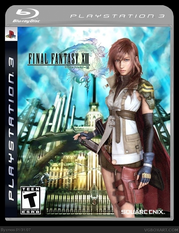
and YES i know the background image is from FINAL FANTASY AGITO XIII but if you know your final fantasy's it's also in FINAL FANTASY XIII and Lightning (the girl) comes from the "Magic School" so it's all good! (and it's the only "drawn/artsy" image available)
The Square logo is a bit too small here, the logos on the Blu ray temp should be transparent aswell.
The FFXIII logo needs to be centered and made bigger, a bit, because FF symbols should normally have an emphasis.
#8 i checked all of my final fantasy games which is pretty much all of em and some do not have the "final fantasy #" centered... and it looks better that way
v3 updated logo size and made box "black texted" because it's...FINAL FANTASY MAN! lol

 Final Fantasy XIII Box Cover Comments
3rd box i've made, excluding the halo 2 one (technically i didn't make it) but including one that i haven't uploaded yet (Lair, i liked this one better so i uploaded this first and i'm limited to 1 box per day cause i'm a noob)
i LOVE this box... not cause it's my own... but because i LOVE FINAL FANTASY and lets face it... this one looks bomb! (haha modesty at it's best)
comment with suggestions so i can update it and rate!
i'm gonna update this eventually with a backside as well so watch out!
[ Reply ]
well the template looks odd because one corner looks sloping while the other is a little bit more squar-ish. other then that it looks pretty good 4.5/5
[ Reply ]
and YES i know the background image is from FINAL FANTASY AGITO XIII but if you know your final fantasy's it's also in FINAL FANTASY XIII and Lightning (the girl) comes from the "Magic School" so it's all good! (and it's the only "drawn/artsy" image available)
[ Reply ]
Odd dimensions....
[ Reply ]
Good comeback crxss, I like this alot. Keep it up ;)
[ Reply ]
#5 :) thank you C.MAN!
[ Reply ]
*edit
cleaned it up a little bit and fixed the corner
[ Reply ]
The Square logo is a bit too small here, the logos on the Blu ray temp should be transparent aswell.
The FFXIII logo needs to be centered and made bigger, a bit, because FF symbols should normally have an emphasis.
Great job though 4/5.
[ Reply ]
#8 i checked all of my final fantasy games which is pretty much all of em and some do not have the "final fantasy #" centered... and it looks better that way
v3 updated logo size and made box "black texted" because it's...FINAL FANTASY MAN! lol
[ Reply ]
a bit dark but good none the less
4.5/5 :)
[ Reply ]
#10, lol i add you as a friend on ps3 network and i get a 4.5? lame shady lol
[ Reply ]
Looks nice. You really should have used this effort for your first box, but you've more than made up for it. 4.5/5
[ Reply ]
i like mine and eg's better ;P
[ Reply ]
#13, i like your back ffe22 but your front doesn't look like a FF box to me, maybe a FAN made FF box
[ Reply ]