![]() »
»
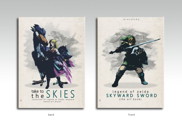
So here is my first boxart for 2013. I have scrapped at least 7 different boxes before finally making one that I really like. All the ones I scrapped all had been very busy designs and such so I decided to go the other way and came up with this. Oh and the circle thing underneath their feet is not a shadow so dont think thats what it is, its just there for perspective purposes. Anyways hope you guys like
 The Legend of Zelda: Skyward Sword Art Book Cover Comments
Comment on Deividas's The Legend of Zelda: Skyward Sword Art Book Cover.
Yes.
Just yes.
[ Reply ]
Beatiful. I will never get to ur skill level. You've outdone yourself again.
Fav'd. So fuc**** well done. ;)
[ Reply ]
It's very strange to see a Skyward Sword box which isn't insanely vibrant. However, I think it looks nice, if not fitting the theme.
[ Reply ]
Why are people saying this is so goo-*full view*- oh.
Very nice.
[ Reply ]
Oh my, this is just plain beautiful.
[ Reply ]
Awesome...
[ Reply ]
I don't know. It's nice and all, and nicely designed, but I feel like it's not really that special.. sorry haha.
[ Reply ]
Wow, uh... It's nicely designed, I will give you that. But I mean, really, the darkness/contrast of this is way off of what this game actually looks like. I don't know, I'm just not feeling it. It just feels way too washed out.
[ Reply ]
The washed out effect and the lack of vibrance is intentional and even though does not fit the game itself, it does fit a Art Book. Inside would contain lots of sketches in black and white and some experimenting with color and such like that. So Art Books tend to be a little more mature than the actual game itself and I believe that the lack of vibrance works very well in this situation. So I was not trying to get the cover to fit the game and thats why it doesnt. But I do understand if you do not like it and thats fine :) Thanks anyways man
[ Reply ]
@Deividas Yeah, I got you. Just doesn't fit right in my mind, you know? Even if it was sketches. But whatever. Different strokes.
[ Reply ]
@Static haha yea its fine.
[ Reply ]
Thanks guys for the support for those who like this
[ Reply ]
I love everything about this except for the typography. Something about that font and the placement of it (mostly on the back) makes me so angry. Other than that, it is absolutely stunning. A perfect fit for an Art book.
[ Reply ]
Congrats Deividas! ;)
[ Reply ]
At last. It ascended :P
[ Reply ]
This Dear Sir is something else!
I'm lost for words! Perfect score!
[ Reply ]