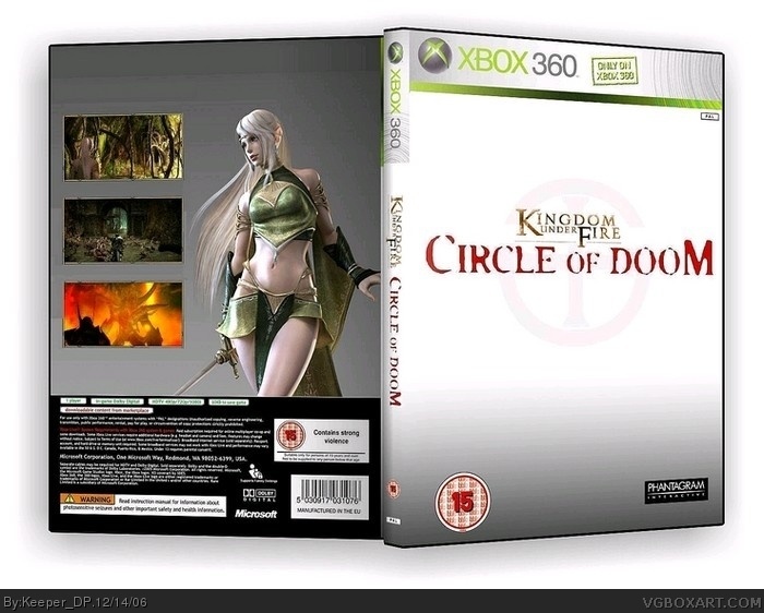
Well isnt´s the official logo. Beacuse the words "kingdom under fire" are from the other games, and the original "circle of doom" background was black.
Suggestions:
1. Add Xboxlive
2. Give the kingdom under fire logo atleast a drop shadow
3. Add some text on the back
4. Make the 15 rateing on the spine biger
5. Move the Dev logos downn a little bit, it looks too high.
Seems a little bland but i'm giving it a 5/5 becuase that fucking eveil thing on the back is bloody hot and it makes up for what you screwed up with "everywhere" else on the box
 Kingdom Under Fire Circle of Doom Box Cover Comments
My first box. The official logo and tks 2006 screens.
[ Reply ]
Well isnt´s the official logo. Beacuse the words "kingdom under fire" are from the other games, and the original "circle of doom" background was black.
[ Reply ]
Petty good first try
Suggestions:
1. Add Xboxlive
2. Give the kingdom under fire logo atleast a drop shadow
3. Add some text on the back
4. Make the 15 rateing on the spine biger
5. Move the Dev logos downn a little bit, it looks too high.
4/5
[ Reply ]
Seems a little bland but i'm giving it a 5/5 becuase that fucking eveil thing on the back is bloody hot and it makes up for what you screwed up with "everywhere" else on the box
[ Reply ]
Way to plain, no text or anything. Looks like a WIP. 2/5
[ Reply ]
#5 I think it a special edition box.
[ Reply ]
It's a start. Post on the forums first. It's just to plain now.
[ Reply ]
In that case, #6, it's a 3/5 I guess.
[ Reply ]
Thanks for your comments =)
[ Reply ]