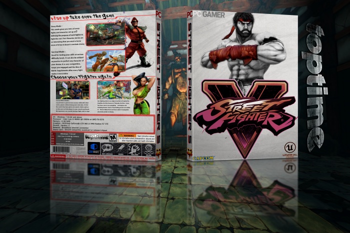
Not really a fan of this, first of all, the back is just a wallpaper, with no info on it.... that just seems lazy.
The front although you have cut out Ryu and put a logo on over the top, again, isn't that much work.
Would also say both sides really don't match imo, this is because of such a drastic change in art styles, ones a drawing and ones a 3d model from the game... Just doesn't work together.
Finally I think your presentation is a bit off putting.
@*toptime* I agree with Vince, this is a very unprofessional and unwilling to work. These images are very view, should reconsider and try to do something different .. something good and really own.
 STREET FIGHTER V Box Cover Comments
Not really a fan of this, first of all, the back is just a wallpaper, with no info on it.... that just seems lazy.
The front although you have cut out Ryu and put a logo on over the top, again, isn't that much work.
Would also say both sides really don't match imo, this is because of such a drastic change in art styles, ones a drawing and ones a 3d model from the game... Just doesn't work together.
Finally I think your presentation is a bit off putting.
[ Reply ]
@*toptime* Hey, guess what the comment section is for?
[ Reply ]
@*toptime* I agree with Vince, this is a very unprofessional and unwilling to work. These images are very view, should reconsider and try to do something different .. something good and really own.
[ Reply ]
@*toptime* just giving my opinion, take it or leave it
[ Reply ]
@Vince_1990 why bother updating, if you don't care what people think?
[ Reply ]
not bad
[ Reply ]
Nice
I like it
Good luck Toptime
[ Reply ]
Can you make one of the PS4 version? Really cool box art!
[ Reply ]
AWESOME!!!!!!!!!!!!!!!!!!!!!!!!!!!!!!!!!!!!!!!!!!!!!!!!!!!!!!!!!!!!!!!!!!!
[ Reply ]