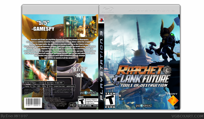
This is the box i meant to be in the competition but i guess TM didn't notice this. Well anyways, enjoy. And please fave it if ya like it, comment and say what do you think.
For me the image on the back doesn't work because there is so much stuff covering that you can hardly tell what it is. Otherwise its good, the front really works well.
The cover looks good. But the back, not so much. I would try re-positioning the screenshots and maybe make the font go around clanks head, in stead of on top of it haha.
 Ratchet and Clank Future: Tools of Destruction Box Cover Comments
This is the box i meant to be in the competition but i guess TM didn't notice this. Well anyways, enjoy. And please fave it if ya like it, comment and say what do you think.
Edited at 1 decade ago
[ Reply ]
For me the image on the back doesn't work because there is so much stuff covering that you can hardly tell what it is. Otherwise its good, the front really works well.
[ Reply ]
The cover looks good. But the back, not so much. I would try re-positioning the screenshots and maybe make the font go around clanks head, in stead of on top of it haha.
[ Reply ]
I like the mood of the front cover, even though it is just a wallpaper.
The back needs some work. The text is kinda boring. Try using some different type of font.
[ Reply ]
I think that whats on the front should be on the back. 3/5
[ Reply ]