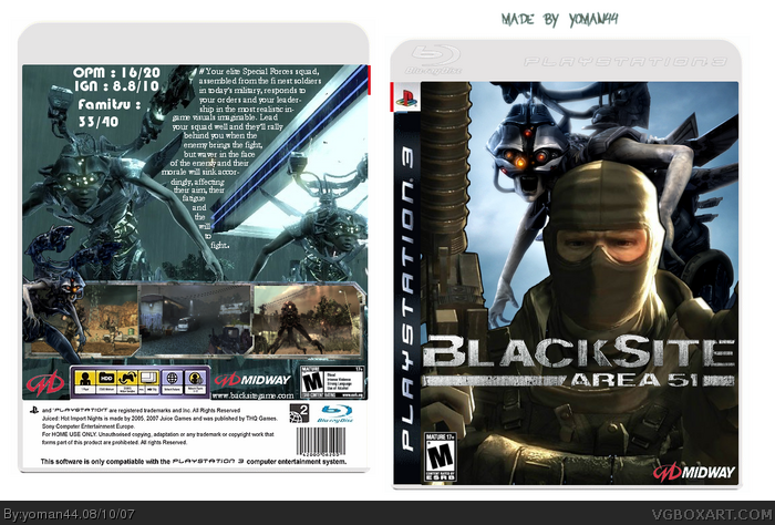
Here's my Blacksite : Area 51. Thanks to Deathspawn11 for the man on front and the alien in front of screens on back. Comments and suggestions are welcome...
The back is cool, but the front is really mediocre.
I see that on the front, you depended on DeathSpawn11's renders. That's not good. Try putting some effort into searching in render sites or even going the extra mile in rendering your own. :)
link
I don't think if it's better but that's barrely all I can. There is no material ! Just landscapes about artworks... If anyone find characters about this game...
I actually disagree about the front. The front looks okay. Nothing wrong with it though it could be better. However the back text in my opinion can be organized in a nicer fashion. The screenshots at the bottom look great though. 3.5/5
I think this is very good.
Only one problem. The review font doesn't look good at all. If you can't find any font's in photoshop/gimp that you like, try searching the web for some.
 Blacksite: Area 51 Box Cover Comments
Here's my Blacksite : Area 51. Thanks to Deathspawn11 for the man on front and the alien in front of screens on back. Comments and suggestions are welcome...
Edited at 1 decade ago
[ Reply ]
The back is cool, but the front is really mediocre.
I see that on the front, you depended on DeathSpawn11's renders. That's not good. Try putting some effort into searching in render sites or even going the extra mile in rendering your own. :)
3.5/5
[ Reply ]
#2, so, ok I going to make a better front.
[ Reply ]
link
I don't think if it's better but that's barrely all I can. There is no material ! Just landscapes about artworks... If anyone find characters about this game...
[ Reply ]
I actually disagree about the front. The front looks okay. Nothing wrong with it though it could be better. However the back text in my opinion can be organized in a nicer fashion. The screenshots at the bottom look great though. 3.5/5
[ Reply ]
Alright!! Nice job.
[ Reply ]
I think this is very good.
Only one problem. The review font doesn't look good at all. If you can't find any font's in photoshop/gimp that you like, try searching the web for some.
[ Reply ]
It's definitely one of your better ones, and I see much more effort on this one. keep it up
[ Reply ]
You are improving.Now keep at it. :)
[ Reply ]
6,7,8,9, Thank you, I going to try to keep it up :D Your comments encourage me :)
[ Reply ]
The demo for this game was horrible. That's all I have to say. :)
[ Reply ]