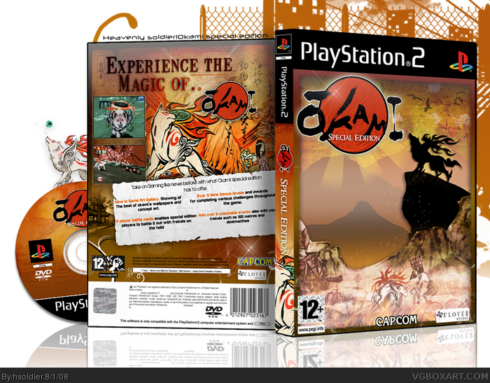
Hsoldier's okami box.yeah now that ive got alot of time on my hands ive been making more boxes:D so here my okami box. Took me a great deal of time to make c and c apreciated. ENJOY!
Most Okami boxes on this site look the same, but this really stands out!
Fav for the awesomeness although I would of preferred the original Capcom logo on the front
Lovely, I absolutely love this. I especially like the silhouette of Ammy on the front, did you make that? Oh and I notice you used a couple of bird brushes on the front. ;)
Back is just as beautiful, some minor nitpicks: Do away with the urban background on the canvas, it ruins the whole feel. I don't feel the logo is necessary on the back, but I've done the same thing before and I understand if it makes it feel more complete. Oh and the white bar where the text is on the back has a lot of awkward spaces - you have to work on the typography (font/spacing) so that the text looks more filling and less awkward.
Other than that, I think this may be your best box yet. Keep it up my friend. ;)
#16, lol, I actually suggest creating the silhouettes with the pen tool, so you'll still have a vector version of it in case you want to use it for future projects without the worry of quality loss in resizing. And I'm impressed, I actually thought most of the front was vector work: Ammy, the cliff, and the mountains for example.
Oh yeah, I'm surprised I haven't added you to my fav authors...it's about time. ;)
@VGM, My camping trip only lasts for 2-3 days, so I'll be back around Sunday. (In time to finish my contest box, Biaooo!)
Looks real cool. Front is great, Back is equally good. Think it would have been nice IMO if you didn't have the red circle of the Okami logo for the back... just the text... and tighten the text in the white section to separate columns.. they left bottom paragraph is running into the right paragraph. ;)
 Okami: Special Edition Box Cover Comments
Hsoldier's okami box.yeah now that ive got alot of time on my hands ive been making more boxes:D so here my okami box. Took me a great deal of time to make c and c apreciated. ENJOY!
Edited at 1 decade ago
[ Reply ]
Most Okami boxes on this site look the same, but this really stands out!
Fav for the awesomeness although I would of preferred the original Capcom logo on the front
Edited at 1 decade ago
[ Reply ]
me gusta mucho +(whatever fav' is in spanish)
[ Reply ]
Greatness, I'm impressed that you did something different with this game and you pulled it off marvelously.
[ Reply ]
WHAT??????
[ Reply ]
thanks guys ;D my first ps2 box !
Edited at 1 decade ago
[ Reply ]
O.o
[ Reply ]
#7, thanks credit to indexeous for the awsome temp!
Edited at 1 decade ago
[ Reply ]
woah dang! this is awesome
[ Reply ]
My first thought was Japanese Lion King =P. I love this, its very different from the others and that's a very good thing.
[ Reply ]
#10, lol you just gave me a idea for my next box, i might not though
[ Reply ]
As i said (eventually ;) ) on Msn this is amazing fav+
[ Reply ]
thanks guys lol japanese lion king! ;D over 500favs wohoo
Edited at 1 decade ago
[ Reply ]
Lovely, I absolutely love this. I especially like the silhouette of Ammy on the front, did you make that? Oh and I notice you used a couple of bird brushes on the front. ;)
Back is just as beautiful, some minor nitpicks: Do away with the urban background on the canvas, it ruins the whole feel. I don't feel the logo is necessary on the back, but I've done the same thing before and I understand if it makes it feel more complete. Oh and the white bar where the text is on the back has a lot of awkward spaces - you have to work on the typography (font/spacing) so that the text looks more filling and less awkward.
Other than that, I think this may be your best box yet. Keep it up my friend. ;)
*goes camping*
[ Reply ]
Agree with LK, except I'm camping the week after next.
You rule man.
[ Reply ]
thanks guy! ;P and LK i didnt make that render just edited one (the one next to the disk)
Edited at 1 decade ago
[ Reply ]
The front is just incredible.
[ Reply ]
Holah shat.
[ Reply ]
#16, lol, I actually suggest creating the silhouettes with the pen tool, so you'll still have a vector version of it in case you want to use it for future projects without the worry of quality loss in resizing. And I'm impressed, I actually thought most of the front was vector work: Ammy, the cliff, and the mountains for example.
Oh yeah, I'm surprised I haven't added you to my fav authors...it's about time. ;)
@VGM, My camping trip only lasts for 2-3 days, so I'll be back around Sunday. (In time to finish my contest box, Biaooo!)
[ Reply ]
#19, everythin excepet from amy was done with the pen tool :D
[ Reply ]
Oh snap it's different from the others.
But really good =D
+fav
[ Reply ]
#21, thanks its about time DS11 lool
[ Reply ]
Oh God
[ Reply ]
#19, I'll be out all week. Feel like bookmarking anything epic I miss? lol :P
[ Reply ]
Very pretty.
[ Reply ]
Looks real cool. Front is great, Back is equally good. Think it would have been nice IMO if you didn't have the red circle of the Okami logo for the back... just the text... and tighten the text in the white section to separate columns.. they left bottom paragraph is running into the right paragraph. ;)
[ Reply ]
Awesome looking!
Edited at 1 decade ago
[ Reply ]
thanks guys
[ Reply ]
Ace dude! :D
+fav
[ Reply ]
TBH, at first I was like "aww, not another Okami box." But this is really cool and original, so it gets a fav from me.;)
[ Reply ]
#30, thanks i think i swicthed up he style pretty good here
Edited at 1 decade ago
[ Reply ]